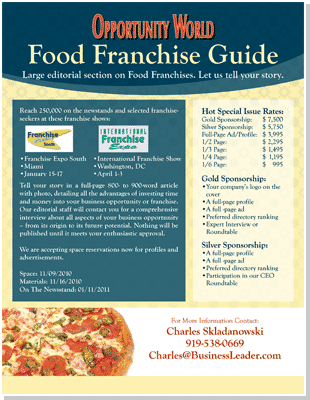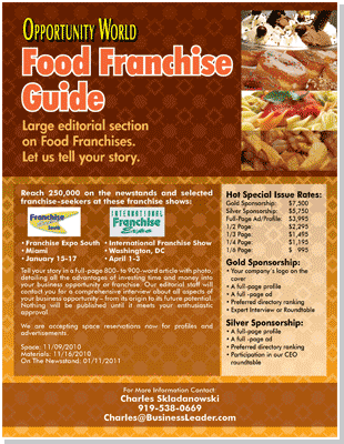


verdigris
(vird-uh-gree)
Verdigris is a green or bluish-green pigment. Its name comes from the Old
French "vert de Grece", which literally meant "green of Greece". It was used
as the primary green pigment up until around the 18th century. Think of the
way copper changes color, as with an old penny, that weird looking green stuff
is verdigris. (By the way, it is a poisonous chemical compound. If you come
across a small child attempting to insert such a penny into a nostril, you may
consider frightening him or her into sensibility with that "poisonous" part.)
Also known as: vert-de-gris, verderame, grünspan, copper acetate.
Source: arthistory.about.com
proscenium
(proh-see-nee-uh-m)
In older theaters, the proscenium is an often-ornate arch defining the front
of the stage. It compromises the "fourth wall" behind which action traditionally
takes place in a theatrical production. Modern theaters seldom have the
proscenium.
Also known as: pros arch.
Examples: In the old Broadway theater, the gold-leaf prosceneum arch reached
stage left to stage right framing an area through which the audience saw the
show.
Source: theater.about.com
grisaille
(gris-eye)
Grisaille, from the French word 'gris' for gray, is a monochrome painting or
drawing, usually in gray but sometimes in sepia tones. Grisaille drawing and
painting from plaster casts are done as the basis of classical art training,
as the technique allows the artist to concentrate on accurate rendering of form
without the distraction of color.
Realist drawings in graphite and charcoal could technically be described as
grisaille, but you'll find the term more frequently used to describe the monotone
underpainting, also called imprimatura, which is used in traditional, layered
oil painting techniques.
Also known as: grayscale, greyscale, imprimatura (when referring to paint)
Source: drawsketch.about.com
scumble
(skuhm-buh-l)
A painting technique where a thin or broken layer of color is brushed over
another so that patches of the color beneath show through. It can be done
with a dry brush, or by removing bits of paint with a cloth.
One of the great advantages of scumbling with pastels over other mediums is
the vibrancy you can achieve with color. Possibly the best method for getting
this is by scumbling after a layer of pastel has been applied, and fixed,
lightly drag a soft pastel on its side across the top. This creates a broken
covering of the new color over the top.
The result is visually stimulating and very textural, and careful choice of
colors will produce amazing results. This method works best with the softest
soft pastels.
Source: painting.about.com
ochre
(oh-ker)
Ochre or Ocher is term for both a golden-yellow or light yellow brown color
and for a form of earth pigment which produces the color. The pigment can
also be used to create a reddish tint known as Red ochre. The more rarely
used terms Purple ochre and Brown ochre also exist for variant hues. Because
of these other hues, the color Ochre is sometimes referred to as Yellow ochre.
Ochres are among the earliest pigments used by mankind, derived from naturally
tinted clay containing mineral oxides. Chemically, it is hydrated iron (III)
oxide. Modern artists's pigments continue to use the terms Yellow ochre and
Red ochre for specific hues.
Source: en.wikipedia.org
encaustic
(en-kaw-stik)
Encaustic (which also goes by "hot wax painting") is an ancient technique.
The artist heats beeswax to the liquid stage, then mixes in pigmentation.
The resulting medium is applied to a surface (typically: wood). After the
artist has everything "just so", heat is applied to the whole business, which
results in a fusion of colored wax and wood. (Yea, verily - they become as
one... an extremely durable one, at that.)
Before the wax cools, an artist can do all sorts of things to his or her
encaustic piece. Metal tools or special brushes can shape and/or texture the
substance (layers of which can be anywhere from thin to relief-map thick).
One may even affix objects (such as coat hangers, or light bulbs) into the
wax, as Jasper Johns is known for doing. Additionally, an encaustic can be
polished to a final sheen, or reworked (through use of heat, again) as much
as necessary until the artist is satisfied.
Source: arthistory.about.com
ferrule
(fer-uh-l)
The ferrule is the part that holds the handle and hairs together, and in shape.
It's usually made from metal, but not exclusively. Mop brushes, for instance,
can have a ferrule made from plastic and wire. A decent quality ferrule won't
rust or come loose.
Source: painting.about.com
sienna
(see-en-uh)
Sienna is a form of limonite clay most famous in the production of oil paint
pigments. Its yellow-brown colour comes from ferric oxides contained within.
As a natural pigment, it (along with its chemical cousins ochre and umber) was
one of the first pigments to be used by humans, and is found in many cave
paintings.
Sienna, in and of itself, is sometimes referred to as "raw sienna", in order
to differentiate it from "burnt sienna", which is a more common pigment than
the raw form. The difference is in the process applied to burnt sienna, which
is raw sienna heated to remove the water from the clay and redden its brownish
colour.
Source: en.wikipedia.org
aqueous
(ey-kwee-uh-s)
A solution in which the solvent is water. It is usually shown in chemical
equations by appending (aq) to the relevant formula. The word aqueous means
pertaining to, related to, similar to, or dissolved in water. As water is an
excellent solvent as well as naturally abundant, it is a ubiquitous solvent
in chemistry.
Substances that do not dissolve well in water are called hydrophobic ('water
fearing') whereas those that do are known as hydrophilic ('water-loving'). An
example of a hydrophilic substance would be sodium chloride (ordinary table
salt). Acids and bases are aqueous solutions, as part of their Arrhenius
definitions.
Source: en.wikipedia.org
vermilion
(ver-mil-'yen)
Vermilion, sometimes spelled vermillion, when found naturally occurring, is
an opaque orangish red pigment, used since antiquity, originally derived from
the powdered mineral cinnabar. Chemically, the pigment is mercuric sulfide,
HgS, and like all mercury compounds it is toxic. Its name is derived from the
French "vermeil" which was used to mean any red dye, and which itself comes
from "vermiculum", a red dye made from the insect Kermes vermilio. The word
for the color red in Portuguese (vermelho) derives from this term.
Today, vermilion is most commonly artificially produced by reacting mercury
with molten sulfur. Most naturally produced vermilion comes from cinnabar
mined in China, giving rise to its alternative name of China red.
Source: en.wikipedia.org
serif
(ser-if)
A serif is the little extra stroke found at the end of main vertical and
horizontal strokes of some letterforms. Some are subtle and others may be
quite pronounced and obvious. In some cases serifs may aid in the readability o
f a typeface. Serif refers, in general, to any style of type that has serifs.
Fonts without serifs are called sans serif.
Source: desktoppub.about.com
chroma
(kroh-muh)
The chroma of a color is a measure of how pure or intense it is, how saturated
the color is. You reduce the chroma of a paint color by adding a neutral gray
with the identical value as the color you're wanting to change. Colors have
three attributes -- hue, value, and chroma. In non-art speak terms, these are
generally simply called color, darkness/lightness, and intensity/saturation.
Source: painting.about.com
vellum
(vel-uh-m)
Traditional vellum is a surface used for writing made from animal skin,
specifically calves, lambs, or goats. The skin was processed and scraped clean,
then 'polished' smooth. The side which originally had the fur on it has a
slightly rougher finish to it.
In contemporary usage, the term "vellum" is used to describe paper that is
relatively translucent and smooth. However, to confuse matters, the term
"vellum finish" is sometimes used to describe paper with a surface texture
that's got a slight tooth or roughness to it, rather than a really smooth
paper. So check the actual paper, don't go by the description alone.
Source: painting.about.com
gravure
(gruh-vyoo-r)
With gravure printing an image is etched on the surface of a metal plate, the etched
area is filled with ink, then the plate is rotated on a cylinder that transfers the
image to the paper or other material.
Also Known As: rotogravure
In contemporary usage, the term "vellum" is used to describe paper that is
relatively translucent and smooth. However, to confuse matters, the term
"vellum finish" is sometimes used to describe paper with a surface texture
that's got a slight tooth or roughness to it, rather than a really smooth
paper. So check the actual paper, don't go by the description alone.
Source: desktoppub.about.com
intaglio
(in-tal-ee-oh)
In the various intaglio printing methods, the area of the image to be printed
is recessed into the surface of the printing plate and the recessed areas are
filled with ink. The incised image may be etched, engraved with chemicals or
tools. The image to be printed is incised into the plates, the incisions filled
with ink, and excess ink wiped from the plates. Heavy pressure is applied to
transfer the ink from the plates to the paper, leaving the surface slightly
raised and the back side slightly indented.
Examples: Intaglio printing is used for printing U.S. paper currency and for
other fine art printmaking. Some forms of printing that use the intaglio
process include engraving and gravure.
Source: desktoppub.about.com
lithography
(li-thog-ruh-fee)
With gravure printing an image is etched on the surface of a metal plate, the etched
area is filled with ink, then the plate is rotated on a cylinder that transfers the
image to the paper or other material.
Also Known As: lithographic printing, planographic, planography, litho
Source: desktoppub.about.com
colophon
(kol-uh-fon)
A list or description of how a book or magazine was produced is its colophon. It may
contain production materials such as software, hardware, typefaces, and type of paper.
Traditionally found at the back of the publication, some modern books place the colophon
near the front. Some Web sites provide a colophon describing how the site was produced.
The word itself is derived from the Ionian city of Colophon.
The colophon can be a simple list or may be presented in narrative, paragraph form.
Source: desktoppub.about.com
masthead
(mahst-hed)
In a magazine or a newspaper you may see the masthead on the cover or front page but
in a newsletter it may be on the inside and it's not the same element.
The masthead is that section of a newsletter, typically found on the second page (but
could be on any page) that lists the name of the publisher and other pertinent data.
The masthead may include staff names, contributors, subscription information, addresses, logo, etc.
Source: desktoppub.about.com
pangram
(pan-gruh-m)
A sentence that uses every letter of the alphabet at least once is a pangram. It comes
from the Greek pan gramma meaning "every letter." The goal of many pangram writers is
to use all the letters, with as few repeats as possible, while still creating a sensible,
clever, or meaningful sentence.
Perhaps the most familiar English language pangram is that typing tutor favorite (and font
sampler text), "The quick brown fox jumps over a lazy dog."
Source: desktoppub.about.com
kerning
(kur-ning)
Kerning is the adjustment of space between pairs of letters to make them more visually
appealing. It is normally applied to individual letter pairs in headlines or other large type.
Kerning is also known as letterspacing or character spacing.
Source: desktoppub.about.com
anti-alias
(an-tee-ey-lee-uh-s)
To smooth out the jagged edges of lines and shapes in digital images that have been aliased, jagged
instead of straight or smoothly curving. The jagged edges of an aliased image are also called jaggies.
In many graphics software applications antialiasing can be turned on or off when using "pencil",
"eraser", "paint bucket", and "magic wand" tools. Not all text or artwork looks better when it is
antialiased. Small text or images sometimes look too blurry when they are antialiased. Antialiasing
can substantially increase the file size of images, making their printing go more slowly, and Web
pages load more slowly too.
Aliasing can be annoying when the resolution of a graphics file is too low. This can occur when
an image is enlarged or copied from a source for which a lower resolution was more appropriate.
Source: artlex.com
recto
(rek-toh)
The front side of any work on paper. May also be the right-hand page of a book. The opposite of verso.
The front and rear sides of other two-sided objects, such as coins, medals, or panels which have a painting
on each side are more often referred to as obverse and reverse.
Source: artlex.com
verso
(vur-soh)
The second or back side of any work on paper. May also be the left-hand page of a book. The opposite of recto.
Source: artlex.com
incongruity
(in-kuhn-groo-i-tee)
A state of two or more things lacking harmony, being incompatible, inconsistent, absurdly combined. Such things
would be described as incongruous. This sometimes results in irony. What makes something humorous or tragic is
essentially an instance of incongruity. Incongruity is an idea explored often by artists influenced by Dada and
Surrealism.
Source: artlex.com
ligature
(lig-uh-choo-r)
In calligraphy and typography, two or more letters joined together to create a single character. Among the most
common such combinations: æ (a+e) and Æ (A+E). Among other letters most commonly combined include oe, fi, ff, and
ffl. When cast type was employed (before the digital revolution), a ligature was cast on the same body of type.
Kerning, by comparison with ligature, is the technique of adjusting the spacing between two letters to bring them
close enough to overlap. Some ligatures, including "æ", might be described as made by kerning. The horizontal spaces
between lines of type are called leading.
Source: artlex.com
lacuna
(luh-kyoo-nuh)
An empty space or a missing part; a gap, a void. A term used most by art historians and art conservators. The plural
form is lacunae or lacunas; adjectival form lacunal.
Source: artlex.com
decorum
(dih-kohr-uhm)
Conventions in matching a subject of an artwork to a style or tone appropriate to it. A kind of etiquette expected
in the treatment of an artwork's content.
Source: artlex.com
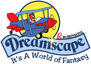
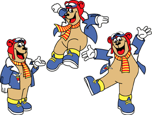
The official logo design for Dreamscape, the family entertainment center of Robinsons Galleria. Biggles the Bear is the theme park's official mascot.
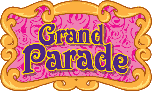
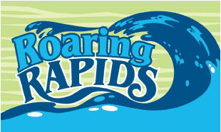
Fancy flourishes blending against a floral pattern characterized the design for Grand Parade, which is the name of the two-storey Victorian carousel at Dreamscape showcasing dozens of lavishly decorated animals. At right is the design for Dreamscape's popular flume ride, Roaring Rapids.
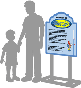
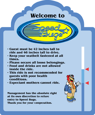
Speed Bugs, the bumper car ride at Dreamscape has a design inspired from a circa 1940 automobile decal. Every theme park ride and amusement facility requires a waiver sign informing guests of safety procedures before embarking. The waiver sign also functions as a height indicator for rider and operator. The design has a standard cloudy frame and sky color palette complementing the aviator's environment as illustrated on the theme park's logo.


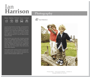
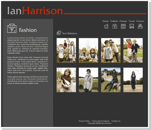

Web page templates for a web site builder at web-7.com.